To find out the place
of color in Expressionist film, I intend to create a general map of cinematic
Expressionism, and by looking over the whole landscape, I hope to find where
color (along with other aesthetic qualities) belongs. To do this, I will first establish four
points of comparison to use as corners for the spectrum of the Expressionist
aesthetic, and then explore a variety of aesthetic properties and styles to see
where they fit on this spectrum.

Fig. 1: Left: two shots from The Cabinet of Dr. Caligari, 1920; Right: What’s Opera Doc?, 1957
Part One:
Four Exemplary Focal Points
The first
point of comparison when determining what is and is not Expressionist must be
the original art movement itself, which became popular in painting and theater
in Europe (primarily Germany) well before it made its way into cinema. While the film movement is now known for
presenting certain kinds of visuals, the movement in painting was based more on
principles than on matching a particular style.
Like other movements from the turn of the twentieth century,
Expressionism was a response to realism, positing that art should reflect the
internal reality of emotional experience rather than attempting to capture how
things objectively appear. The result was
a group of paintings with a fairly flat look, often avoiding detailed,
realistic shading in favor of solid colors enclosed in big, black
outlines. The portrayal of humans in
this particular style can’t carry over to cinema very easily, but the artists
in this movement were also fond of wild, jagged distortions, which do carry
over into the cinematic movement (Bordwell 104). In terms of color, the Expressionist painters
may not have been striving for realism – consider “In A Village Near Paris” by Lyonel Feininger with a sky of solid
pink – but even so, their color schemes were less intense than that of the climax
of What’s Opera, Doc?.
The Cabinet of Dr. Caligari is said to
be the first film in the cinematic Expressionism movement, so naturally it set
the standard for the movement and thus serves as another good tentpole for this
analysis. While other German horror
films from the same time period using more realistic sets, such as Nosferatu, tend to get grouped with the
same movement, Caligari is the film
with the most distinct style, and consequently, a film is most recognizably
borrowing from German Expressionism when it borrows from Caligari. The scenery in
this film stands out for being wildly jagged, reflecting the mad psychology of
the main character, and its sharp edges and distorted shapes are considered
typical of the Expressionist style.
Right angles, it seems, are forbidden.
The lighting makes use of chiaroscuro, which involved sharply
contrasting light and shadow for dramatic effect (Brockmann 50). The lighting, too, seldom makes the shapes
one would expect it to, and is often entirely impossible.
The performance style
in Caligari might be called
“theatrical” today, but it should be noted that the Expressionist theater
movement also stood out for the performance styles of its actors. The theater movement reacted against
realistic performances in theater, so its aim was to be unrealistic and overly
emotional (Bordwell 103-104). For this
reason, it may seem like theatricality is the wrong term to use to describe the
acting in Caligari, but I argue that
the acting in Expressionist films naturally had a different context simply
because acting in film is different from acting in theater, which I think
justifies the use of the term. Even when
striving for realism, actors on a stage must
ensure that all of the audience can see and hear what emotions or actions they
are portraying, which takes away their ability to behave entirely
naturally. In film, on the other hand, a
style of acting had been developed that went further than theater could with
its realism and its subtlety, taking advantage of the fact that small details
of a performance can be made clearly visible with a close-up. Caligari,
then, stands out just by ignoring this fact and suggesting that actions had to
be big and exaggerated in order to be visible, but even by the standards of theater,
the awkwardly dance-like and even jerky movements of the film’s characters do
seem peculiar (Bordwell 103-104).
German Expressionism
is also known for having a large influence on film noir, but through film noir
and its predecessors, Hollywood was developing an “American Expressionism,”
which serves as another important point for comparison. German Expressionism had its impact on
Hollywood as early as 1931 in the horror films of Universal Studios, including Dracula (1931), Frankenstein (1931), The
Mummy (1932), Murders in the Rue
Morgue (1932), The Old Dark House
(1932), The Black Cat (1934), and The Bride of Frankenstein (1935)2. While these films took great care in their
design, decor, and camera angles, the lighting in particular is what carried
over into film noir. In combination with
the influence of Val Lewton, a Russian-born producer at RKO who produced ‘B’
horror films and thrillers, these films laid the groundwork for the technique of
using lighting to turn ordinary people and urban settings into a nightmarish
scene, which would become commonplace for films noir in the 1940s (Spicer 16-17). Some shots in film noir and other dramas from
the same time period take chiaroscuro to its extreme, harshly lighting only
parts of an actor’s face and leaving much of the shot pitch black. Orson Welles also shaped film noir, and his Citizen Kane is sometimes cited as the
primary example of American Expressionism, playing with odd angles, harsh
lighting, mirrors, superimpositions, and distorting camera lenses, seemingly
single-handedly establishing the tone of film noir (Spicer 18-19).

Fig. 2: The Black Cat, 1934.

Fig. 3: Film noir Raw Deal, 1948

Fig. 4: Citizen Kane, 1940
The fourth noteworthy
point of comparison, I argue, is the early work of Tim Burton. Not every scene in every film he made in his
early years is exemplary of Expressionism, but many scenes in Ed Wood and the majority of Beetlejuice are clearly playing with the
jaggedness and the chiaroscuro that have come to be associated with
Expressionism today. So, why should
Burton’s work be its own point of comparison instead of just another example of
the American or German Expressionist style?
The simple answer is that Burton is famous for this style, and he
employed it at a time when it was not part of any movement or cycle, so to many
of today’s moviegoers, anything that resembles The Cabinet of Dr. Caligari would be thought to resemble the work
of Tim Burton, because he is the primary contemporary figure to employ this
style. It is worth noting that the 1970s
had their own highly theatrical and intensely lit horror films, and the
mainstream Hollywood films of the 1980s also tended to employ theatrical
lighting on a level that had been uncommon before the 1980s, so for Burton’s
work to stand out during this time5, it must have been seen as a
stylistic extreme, thus making it a good point of comparison.

Fig. 5: Tim Burton’s Pee-Wee’s
Big Adventure, 1985
Part Two:
Mapping out the Landscape Between the Four Foci
With these points
of comparison in mind, let us now identify and clarify what properties exactly
are required to call something “Expressionistic,” starting with the
acting. Now that it has been established
that The Cabinet of Dr. Caligari
featured an over-the-top, theatrical style of acting, should this be considered
a part of the essence of Expressionism?
It probably shouldn’t be, simply because over-acting is something that
appears too often outside of Expressionism and that does not occur often enough
within Expressionism. Over-acting is
seen as fairly awkward, and consequently, it is often comedic, which is why it
has become associated with film comedy.
Theatrical over-acting is obviously an important part of vaudeville, and
it is common knowledge that vaudeville comedians laid much of the groundwork for
film comedy, so it should be no surprise that it has become part of the film
genre. The behavior of Charlie Chaplin
in Modern Times is anything but
realistic, aiming for the awkward, exaggerated, and theatrical, setting a
standard for film comedy that has never quite left. Over-acting is an important part of Madeline
Kahn’s performances in the films of directors like Mel Brooks, and it has a place
in the works of contemporary filmmakers like Seth Rogen, so it is difficult to
say that the exaggerated performance style is still primarily associated with
Expressionism.
Perhaps part
of the reason why the extreme acting style of Caligari seems less essential to Expressionism than other aesthetic
qualities of the film is that the other three foci are generally studied for
their crafting and design, which isn’t a part of a character’s performance –
but it is a part of a character’s design.
From the wild hair of Dr. Caligari to the long, pointed ears of Count
Orlok, the early German Expressionist films are remembered in part for the
costumes, masks, and make-up that morph their actors to match the madness of
the characters they play. This theme is
continued clearly in Burton’s work, particularly with the characters of Beetlejuice and Edward Scissorhands. It also
has a place in the early horror films of Universal that shaped American
Expressionism, but this raises a problem: nearly all American monster movies
and most American horror movies since the 1930s have had characters with
extreme masks and make-up, so it is very difficult to see this as a distinctly
Expressionist trait (even if it is granted that German Expressionism may have
been a significant influence on these films).
It follows that both of these aspects (theatrical performance and
theatrical character design) may be described as aesthetic “bonus features” –
properties that may not be essential to the aesthetic, but add to it and help
make it more recognizable when they are present (like a private eye in a film
noir).
What is much
harder to deny is the essential importance of the theatrical look of the
environment in Expressionism, even if the environment would look normal and/or
realistic without the use of theatrical lighting. When the lighting is the source of the sense
of theatricality, this sense comes from the fact that the lighting projects the
intense emotion of the scene onto the environment, typically by using heavy
shadows. The light is not spread evenly
throughout the shot, as would be the case with three-point lighting, but is
instead focused on specific spaces, often impossibly so. The shadows tend to make hard lines and
angles that cover the walls and the actors’ faces, sometimes with the
implication that the light is shining through a window, such as the technique
in Citizen Kane of adding a visual
sense of violence by cutting up the screen with hard lines.
Theatrical
sets make the Expressionist version of theatricality harder to identify. If Expressionist sets can be called
“theatrical,” it is not because of their shapes and angles, as theater is not
known for employing such contorted, “cartoony” shapes in its sets. It must be because of the sense of “fakeness”
– the sense that the space is a crafted world, designed only to be seen from a
few different angles at most, and made with artistic materials like wood and
paint. The backdrop of the little town
on a hill used frequently in Caligari
is not meant to look like anything but
a painted backdrop, and this is convenient for horror filmmakers with low
budgets who can’t afford to build full sets on big soundstages for their
films. Of course, another visual
approach that would have also saved money and also resembled theater productions
(of a different sort) is setting the scene in a black, empty space, like the
scenes in which Mork speaks to Orson on Mork
& Mindy6.
Expressionism generally strays away from this, instead relying on sets
that serve as their own spectacle, bringing the viewer to a fantastic space.
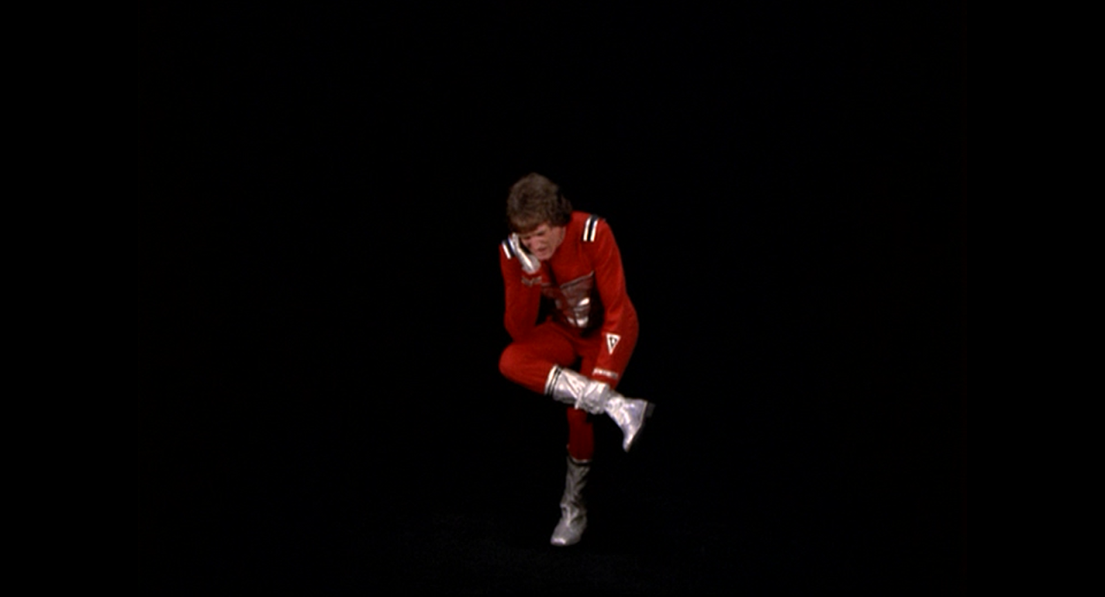
Fig. 6: Mork & Mindy, 1978
This raises a question: should the Munchkinland of 1939’s The Wizard of Oz or the moon of 1943’s Münchhausen7 be considered Expressionist simply because they create theatrical, fake-looking, fantastic spaces? I think there are two reasons to answer negatively to both of these questions, and to find them, one must only look at very similar scenes from other films that come much closer to the look of Caligari or Beetlejuice by comparison (due to small, but noteworthy differences in style). Note how similar Disney’s Babes in Toyland adaptation (1961) creates a very similar aesthetic to that of Oz’s Munchkinland, but the scenes in the villain’s house look distinctly different from those in the town. Barnaby’s house is entirely crooked and angular, using the technique from Caligari of making a space reflect the psychology of the character occupying it8. It is true that Munchkinland also matches the mood of its inhabitants, but the set of Barnaby’s house relies more on cartoony, simple lines and shapes, and there is also something inherently Expressionist (based on my four primary focal points) about darker, shadowy, places rather than lighter, happier places. If there is any good example of a brightly lit environment that still feels, at the very least, related to Expressionism, it is probably the city on the moon in Terry Gilliam’s remake of Münchhausen, which makes all of the buildings in the city entirely flat, as though they were made to be flats in a theater production. This sense of simplified, cartoon-like, flat images creating a warped, unsettling, and/or intimidating space that matches the mood of the scene seems to pinpoint the precise way in which Expressionism is fundamentally theatrical9.

Fig. 7: Munchausen,
1943 
Fig. 8: Babes in Toyland, 1961

Fig. 8: Babes in Toyland, 1961

Fig. 9: The Adventures of Baron Munchausen, 1988
With all
this established, I can now return to the question of color. It is true that the original paintings in the
Expressionist movement did not rely on particularly vivid or bright colors, and
it is true that both German Expressionist film and American Expressionist film
developed in black and white, but I still believe vivid, extreme color is part
of Expressionism. My reason is that
bright colors are part of the artificial, exaggerated look of theater, as
colorful sets tend to look more cartoony and make it more obvious that the sets
are drawn or painted. Musicals in
particular are known for intense colors in their lighting – when a character sings a song expressing
anger, the lights with red gels are turned on, either creating a solid red
spotlight or a red wash across the stage.
This makes for an entirely unrealistic, but completely understandable,
visual representation of the character’s internal feelings. Theatrical productions also use very simple,
basic colors for much of their lighting, so green environments look very green, and the night looks very blue. If the high-contrast lighting of American
Expressionism can be said to be theatrical, then it must also be considered
theatrical, and, on some level, Expressionist, when high-contrast lighting
happens to use vivid gels.
This, I
think, is the way Tim Burton movies of the 1980s use color, but it also
suggests that a little bit of Expressionism can be easily incorporated into the
styles of movies set in more realistic worlds.
Horror movies of the 1970s such as Dario Argento’s Suspiria (1977) create a sense of being in a horrific, fantastic
space even when the setting is the real world because, in many situations,
intensely colored lighting is plausible10. If the setting of the scene is a theater,
then it is easy for films to use this kind of lighting without entirely losing
a sense of realism, so the film can resume its objectivity once the story moves
to another location (consider the climax of Brian de Palma’s 1974 Carrie film11). (This is not unlike the way that Leontine
Sagan’s Mädchen in Uniform [1931] – a
film in the new objectivity movement, which is considered reactionary against
Expressionism – features scenes
with Expressionist lighting, because it seems like it could plausibly be coming from a
real window.) Based on all of this, I
think directors in the 1980s relied on extreme, theatrical colored lighting
frequently for their films, creating a sort of “80’s Expressionism.”12

Fig. 10: Suspiria, 1977

Fig. 11: Carrie, 1976

Fig. 12A: Back to the Future: Part 2, 1989

Fig. 12B: Gremlins, 1984

Fig. 12C: Heathers, 1989
All of this put together makes for, I hope, a fairly comprehensive map of the Expressionist aesthetic. Between Expressionist painting, German Expressionist film, American Expressionism, and the early works of Tim Burton, there is a reasonably clear picture of what Expressionism is. Theatrical and over-the-top acting and character design may be optional, but a theatrical look is key. This may be accomplished by having flat, artificial looking sets, impossibly vivid colors, and/or intense, high-contrast lighting, but either way, there must be a sense of intense, troubled emotion. The style focuses on the jagged, the crooked, the twisted, and the awry, to reflect this feeling in the character’s psyche and/or convey this mood to the audience. Ironically, I haven’t addressed the question of where cartoons fit into Expressionism, but animation’s relationship to both visual arts (such as painting) and the development of cinema is so complex that this would require another essay entirely. For now, it is clear that the colorful and cartoony does, in some way, belong in Expressionism, and as long as I can go win an argument with that one animation professor, I’m satisfied.

What’s
Opera Doc?, 1957
Sources
Brockmann, Stephen, A
Critical History of German Film, Camden House, 2010.
Spicer, Andrew, Film
Noir, Pearson, 2002.
Bordwell, David, and
Kristin Thompson Film History: An
Introduction, 2nd Ed., McGraw-Hill, 2003.
Submitted by J. D. Hansel.
No comments:
Post a Comment